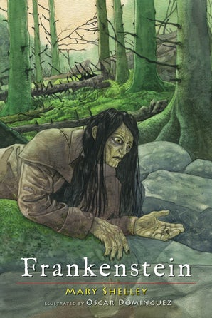
A couple of years back I illustrated Frankenstein for Skyhorse Publishing.
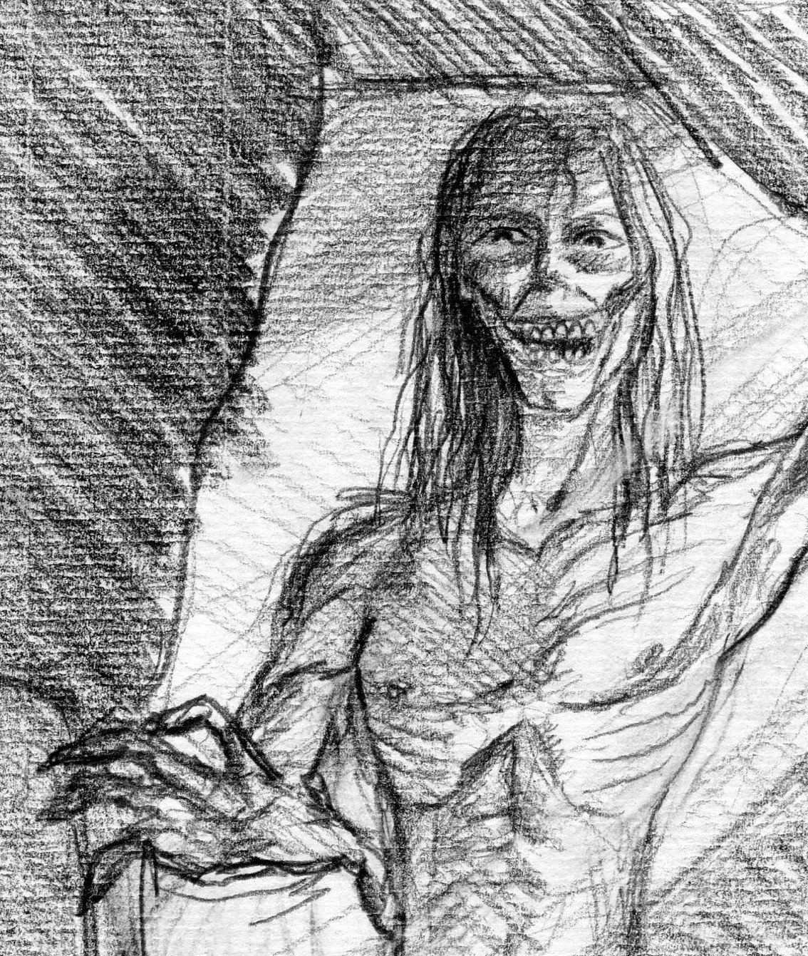
Designing the monster of Frankenstein was the main challenge of illustrating this book.
The creation process of the creature, for instance, in the book is just implied, a big difference from the movies in which it's a main plot point.
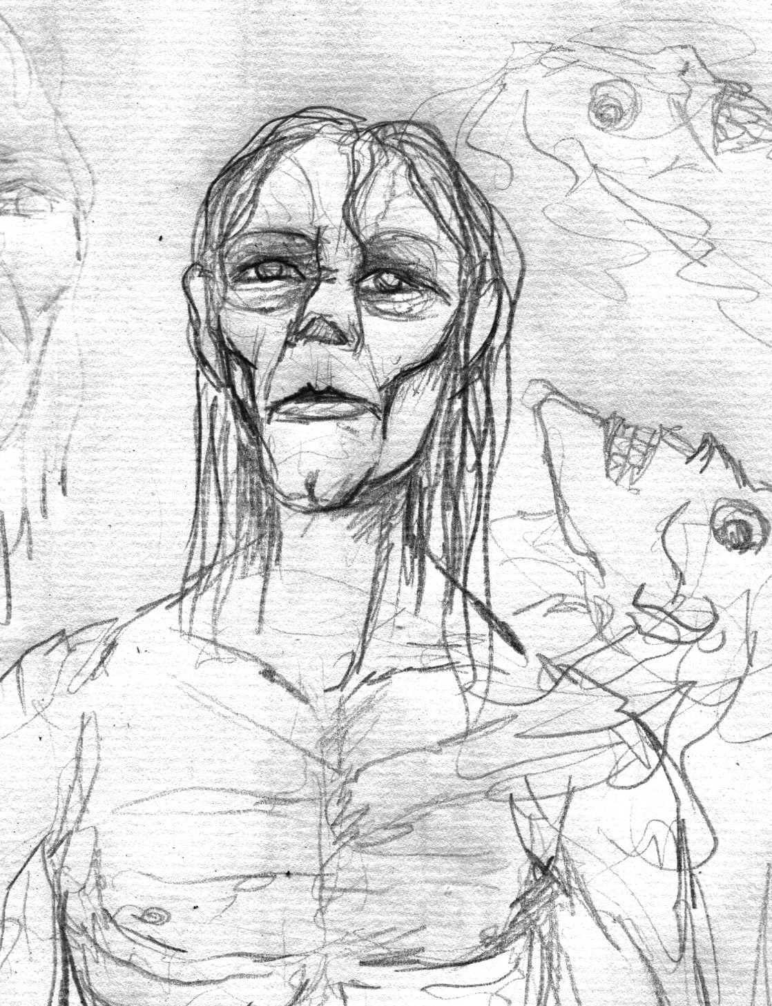
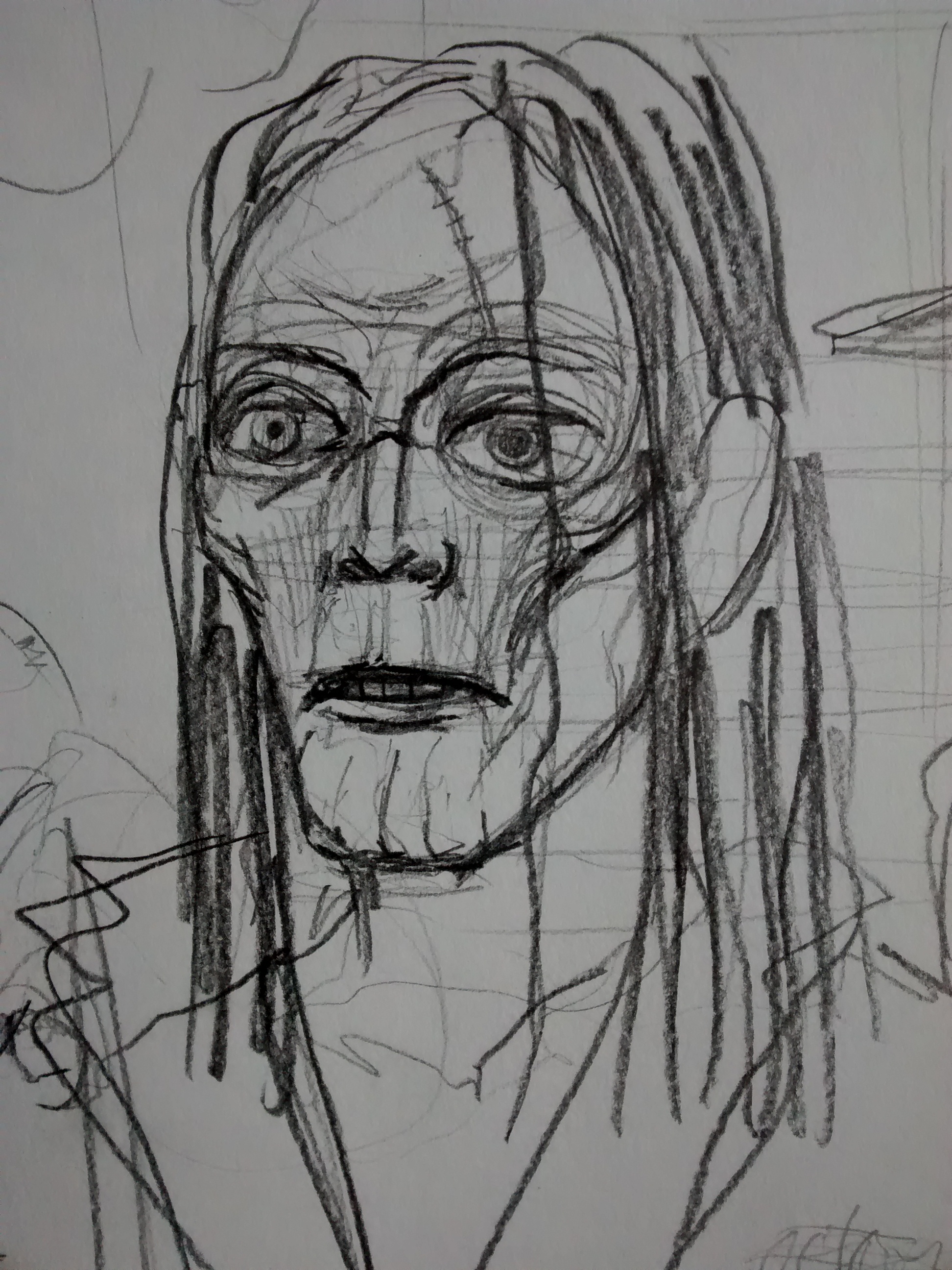
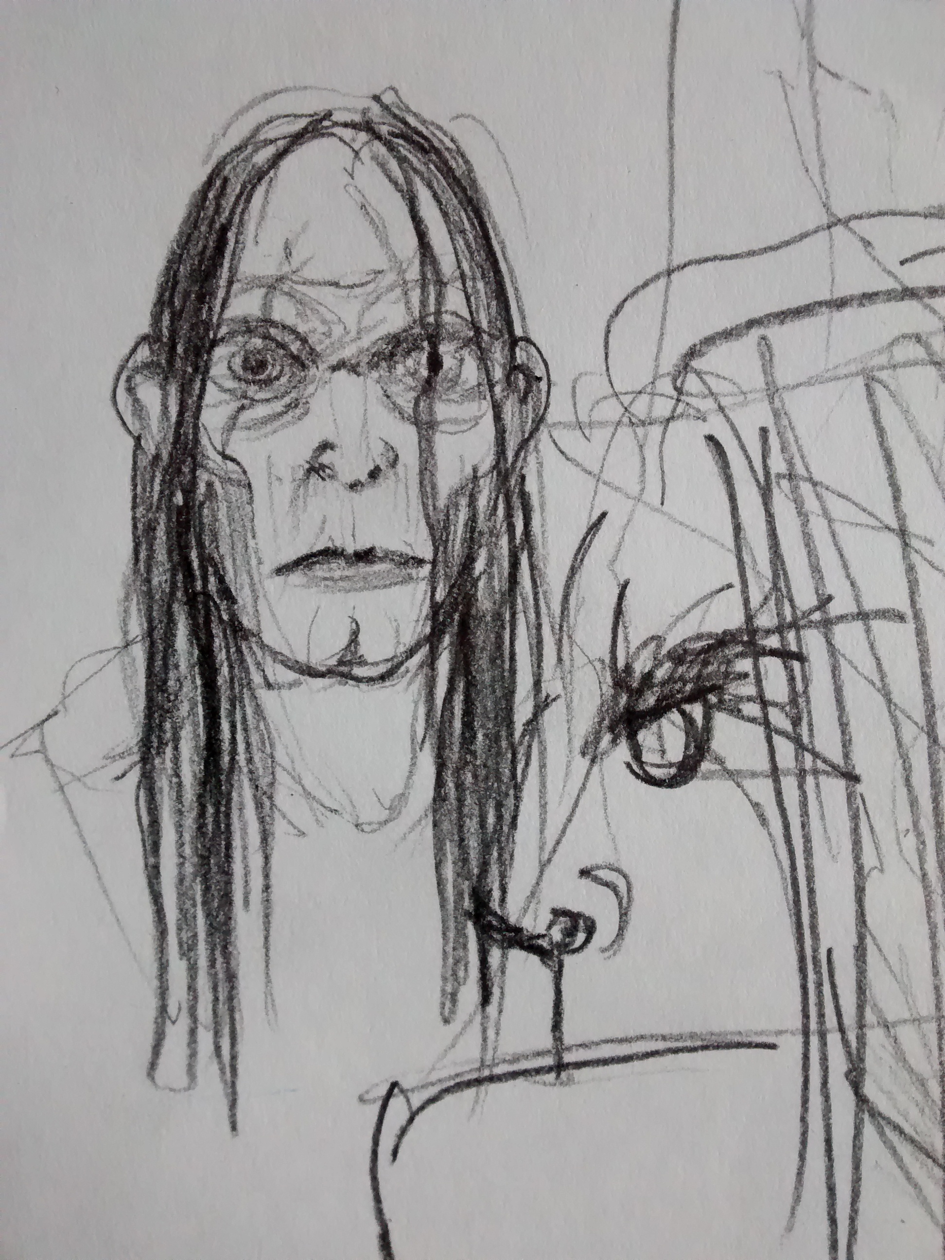
The way Victor Frankenstein's studies are described, through obscure ancient books, and direct anatomic observations, led me to an alchemic approach. The monster's description when he's animated works well with that concept. All this translated in subtle scars and no big stitches or different body parts: he was created as a whole, "somehow", the secret is never shared.
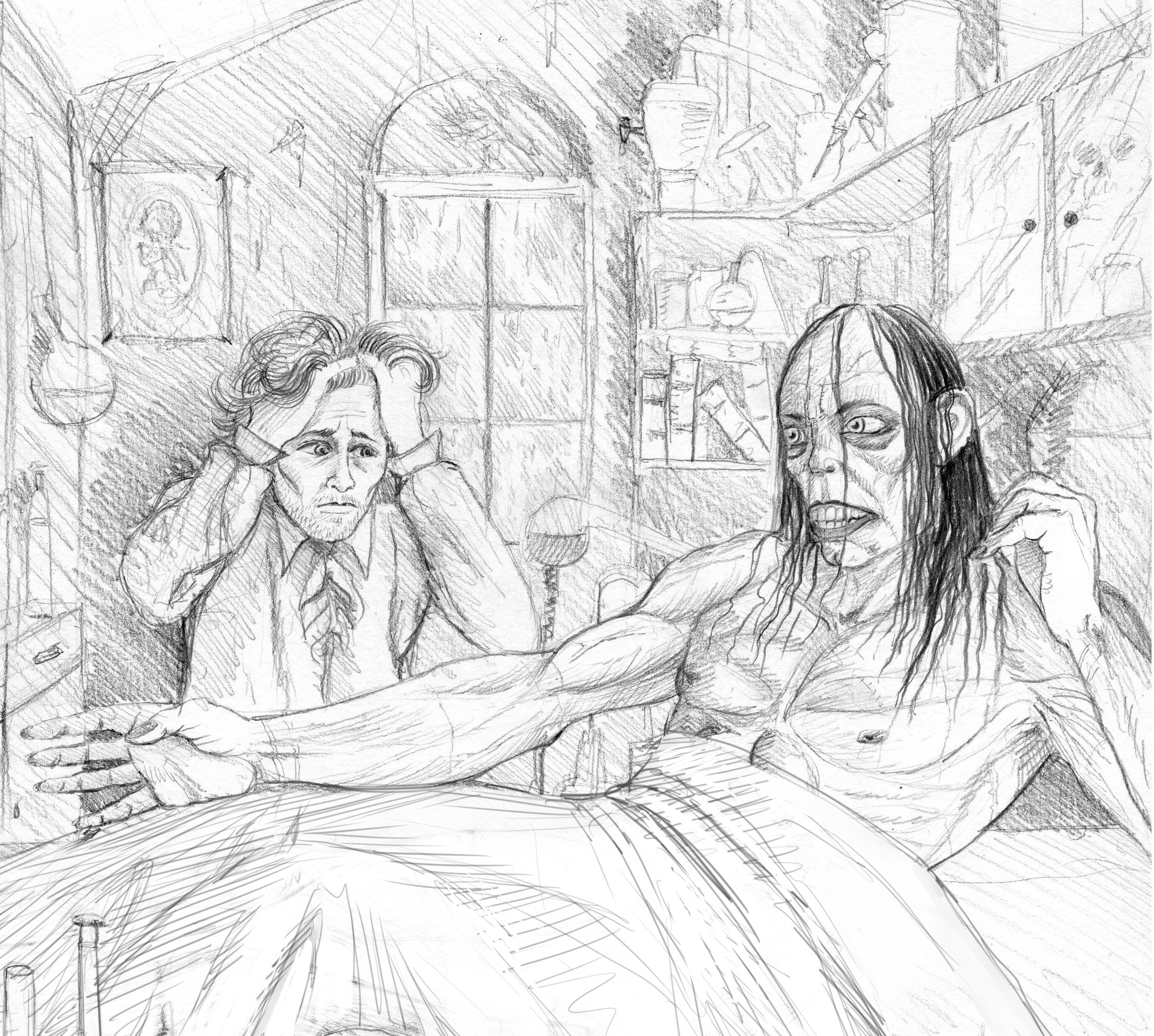
These are a few of the initial sketches:
 |
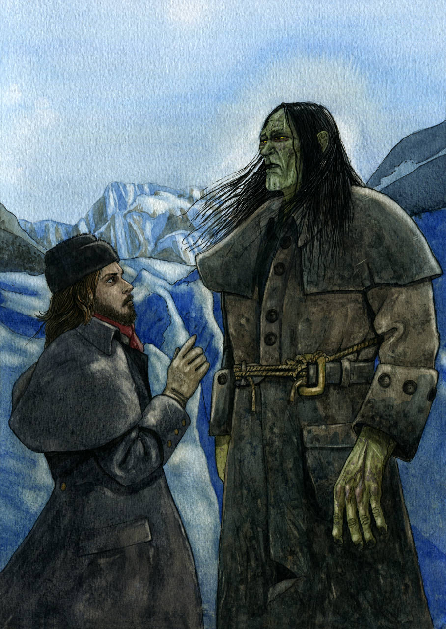 |
| In the end, I decided for a more human look rather than monstruous, which I think fits better with the personality he develops. | The most notorious monster trait was the size difference with a regular person (over 2m tall) |
 |
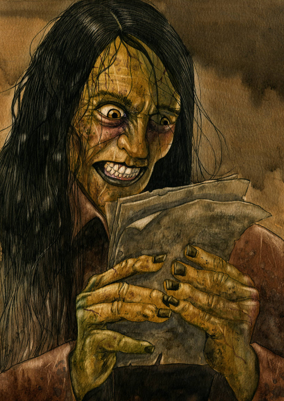 |
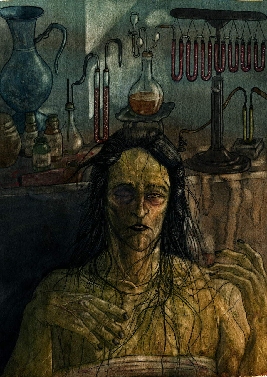
| "His limbs were in proportion, and I had selected his features as beautiful. Beautiful! Great God! His yellow skin scarcely covered the work of muscles and arteries beneath; his hair was of a lustrous black, and flowing; his teeth of a pearly whiteness;but these only formed a more horrid contrast with his watery eyes, that seemed almost of the same color as the dun-white sockets in which they were set, his shriveled complexion and straight black lips." | The "monster" isn't created at the lab. |
This is, in my opinion, the scariest part of the book, and at the same time the most sad:
"I started from my sleep with horror; a cold dew covered my forehead, my teeth chattered, and every limb became convulsed; when, by the dim and yellow light of the moon, as it forced its way through the window shutters, I beheld the wretch—the miserable monster whom I had created. He held up the curtain of the bed; and his eyes, if eyes they may be called, were fixed on me. His jaws opened, and he muttered some inarticulate sounds, while a grin wrinkled his cheeks. He might have spoken, but I did not hear; one hand was stretched out, seemingly to detain me, but I escaped and rushed downstairs"
There've been some scenes, like this one, that, as much as I liked them, I chose not to illustrate: I felt they worked better in text, and that a drawing might ruin the subtlety that made them special.
It is said that an image is worth a thousand words, but I think it's a two-way thing, and there are words that don't always translate well into an illustration. Frankenstein is a book that is filled with both kinds of scenes: good for drawing, and good for just reading.
You can get the book HERE
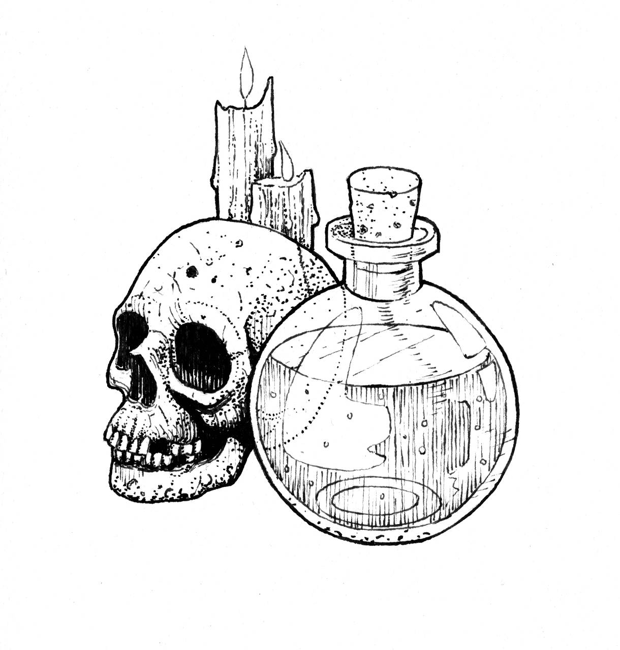
It features 28 color illustrations, and 24 spot b&w drawings.
